CSS regression checklist: what to retest after a small style change
A practical CSS regression checklist for shared components, interaction states, mobile layouts and translated text. Includes an impact map and retest record.
The pricing button needed more space. The CSS change fixed it. On the contact page, the same button style now pushes the submit label outside its container.
That is a fictional example, but it makes a useful review question: where else does the changed rule apply? Build the retest around those places instead of checking only the screenshot attached to the original task.
Write a small impact map before testing
Ask the developer which selectors, components or tokens changed. A spacing token used across a site needs a different review scope from a rule used by one component.
For example, imagine a change to the padding of a shared .button class. Make a short list of its relevant uses:
| Place | State to check | Expected result to agree on |
|---|---|---|
| Pricing cards | Longest plan action | Label fits and the card layout stays usable |
| Contact form | Default, focused and submitting | Action remains visible and its state is understandable |
| Header | Narrow layout with menu open | Action and menu controls do not overlap |
| Dark section | Default and focused | Label and focus treatment remain visible |
These are proposed review criteria for the example, not a list of defects observed in OkFlow. Replace the rows with the actual uses in your project.
Selector matching is only part of the investigation. The cascade also determines which declaration applies; MDN’s specificity guide explains how precedence and selector weight interact. Inspect the affected element rather than assuming that the rule you edited is the one producing its final style.
Make the before-and-after comparison fair
Use the same page, viewport and content for both screenshots. Match the language, scroll position and interaction state too. If a menu is open in one image and closed in the other, the comparison answers a different question.
Record the build or commit for each image. If the previous build is unavailable, say so. Do not recreate a guessed “before” state and present it as release evidence.
Keep volatile details under control when possible: use sample data and the same number of cards or tasks. This makes the change easier to inspect without hiding the realistic long title or error message that could expose a layout problem.
Check the state after the first click
A static image can show the default button and miss its focused or disabled appearance. Test the states that the component actually implements, including any busy state during submission.
For navigation changes, follow the keyboard QA route. For a form action, check its validation and recovery against the agreed acceptance criteria. Read the result and try the next action instead of treating a color change as proof that the flow works.
If the change affects animation, ask which motion preferences are in scope and test those configurations. Keep the expected behavior with the task so the reviewer is not guessing whether an animation should run.
Try the content most likely to break the layout
Use a long real label, a validation error, an empty state or a fuller card where those states belong to the component. Check the supported languages rather than assuming the shortest English text represents them all.
Try widths around the affected layout transition as well as the team’s usual presets. Then run the important journey on the agreed physical device. The mobile testing guide helps keep emulation results separate from device checks.
When an issue appears elsewhere, add it to the impact map. A second affected component is a reason to revisit the scope, not just another screenshot to attach to the first task.
Confirm the fix exists in the delivered build
A change made in DevTools is useful for investigation. It is not, by itself, a deployed fix. Chrome’s Changes panel documentation explains that the panel tracks edits made within DevTools; persistence needs additional setup.
Review the agreed build in a fresh page load without your temporary inspection edits. Repeat the original failure and the related checks in the impact map. If something was not tested, leave it explicitly open.
Copy this retest record
Original problem and expected behavior:
Changed selectors / components / tokens:
Build before / build after:
Affected pages and component uses:
Languages / widths / device scope:
Default, focus, busy and other relevant states:
Long, empty or error content checked:
Original failure retested:
Related checks and observed results:
Evidence / reviewer / unresolved cases:
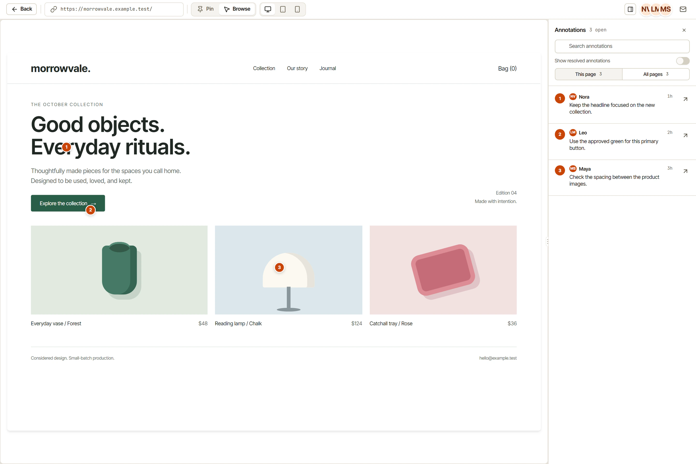
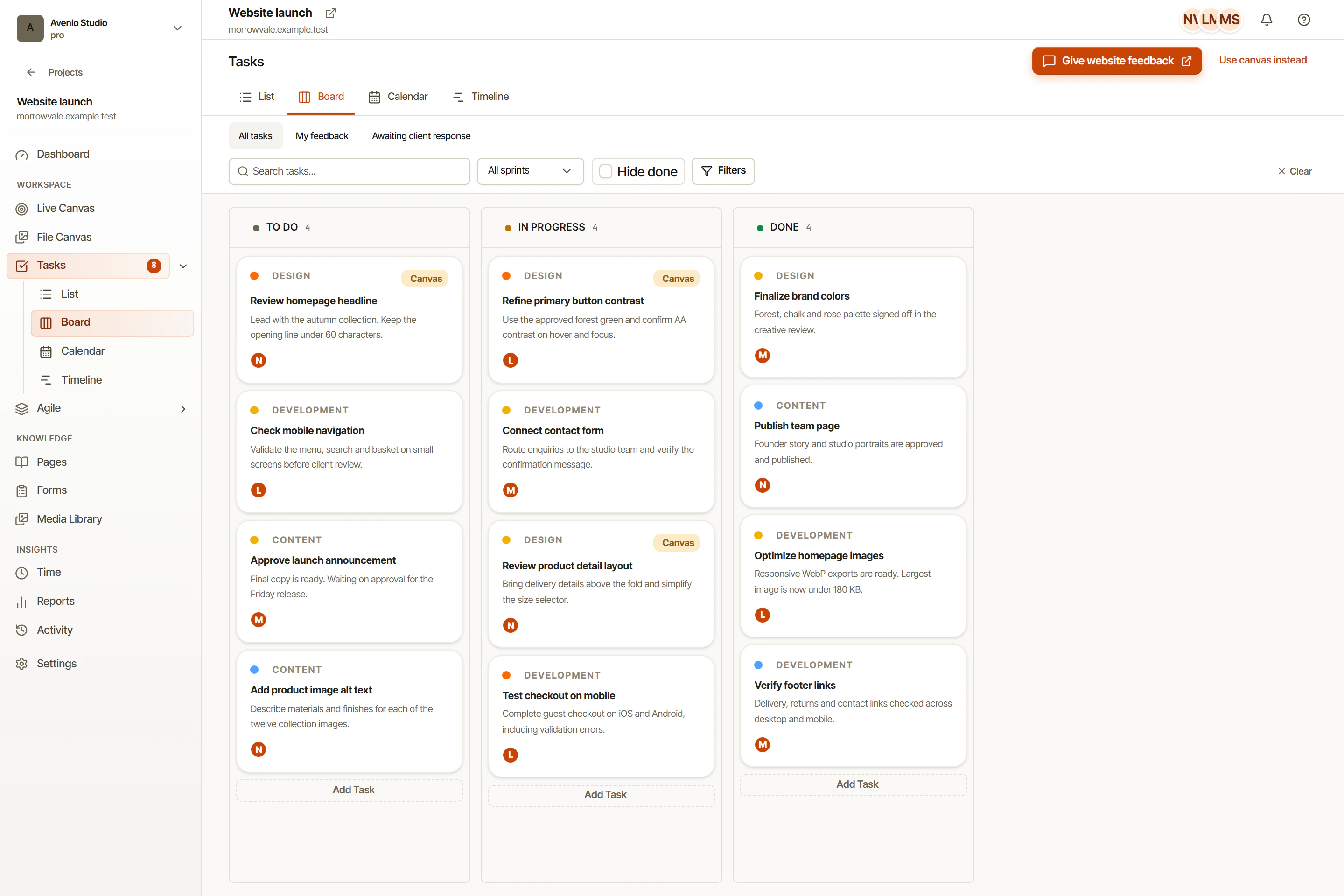
In OkFlow, keep the visual website comment connected to its task, with the owner and retest result close to the original feedback. Use a separate bug report when another failure needs its own steps or expected result. Close the original task with the scope you actually checked.